Data Visualization
The function of visualization is knowledge, not beautiful images
Data is useless if it cannot be understood, and turned into insights. Data visualization is the act of communicating data in a visual and intuitive way. At 23C we are well versed with graphic design in 2D or in 3D, and we know how to merge graphics, sound and code into one inspiring experience.
We have developed a great experience in creating 3D animations and renderings over the years. With a versatile team of 3D-designers, -programmers, and -artists there isn't much we can't do. We can take your existing CAD drawings and tie them into a communicating experience on your pad, or project moving graphics and video on a large 3D-surface such as a building facade, or even print holographic 3D-images. The ways we can present data is only limited by your imagination. Everything we dream up is not only possible, but also incredibly cost-effective.
Case: Sextest
23C visualised vast amounts of data into an interactive Sex Test, for Aftonbladet – Sweden’s largest newspaper
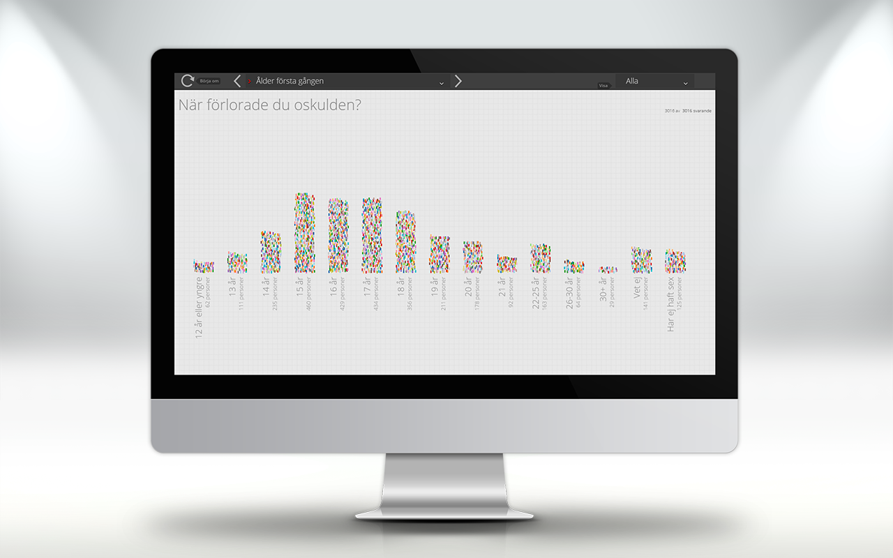
Aftonbladet, Sweden’s largest daily paper, created Sweden’s most encompassing study on peoples’ sexual habits across 17 years. In a country-wide, statistically representative study, more than 3.000 Swedes answered questions about their sexual habits. Only two studies have been published before: 1967 and 1996. This article series continued for seven consecutive days and reached more a million unique readers.
23C created a visualization tool, which sparked a flurry of activity on Twitter, in order for people to make sense of the vast amount of data – each responded replied on more than 20 questions, the raw data-file was more than 2MB!
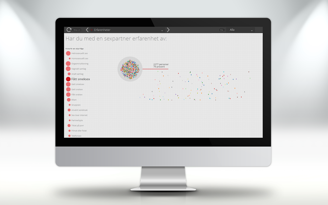
Every “blob” represents a respondent, click one – or a group – to follow them through the survey
In order to keep portability, speed and SEO at a maximum, we opted to
create all the visuals in HTML5 Canvas with support of an API - the
visualization tool can run on your phone and tablet! Every respondent is
represented, and animated, in the visualization tool. By clicking a
person, or a group, you can follow them around and see how they've
answered, and also group them with others that has the same affiliations
and/or answers.
Case: Fortress Europe
It's extra important that state agencies' websites are responsive to the viewport of their visitors
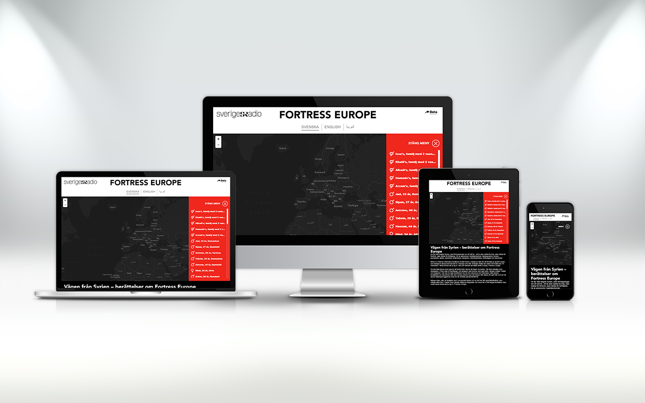
People are fleeing from Syria, in an attempt to start a new life without fear of war, oppression or persecution. Among them are bankers, engineers, journalists, doctors, students, farmers, shopkeepers and industry workers. Many of refugees have travelled to Turkey to try and find a way into Europe. Reporters from public service company Swedish Radio – in cooperation with the BBC, Radio France, Bayerischer Rundfunk and the European Broadcasting Union (EBU) – have been in contact with over 70 Syrian and their families, following their stories over the past year, in their attempts to enter what has been called “Fortress Europe”.
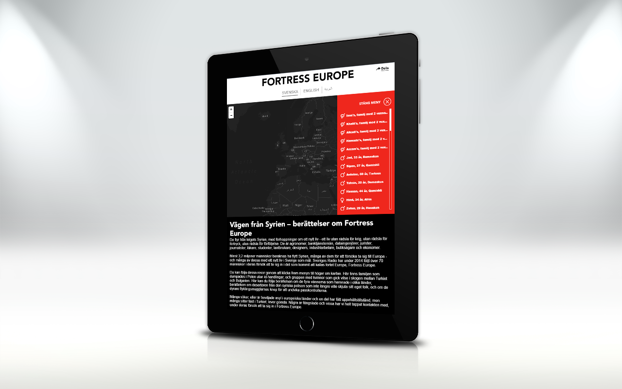
23C visualised data on the refugee crisis for Swedish Radio
23C were invited to visualise the data online, highlighting the real people behind the statistics. By using CartoDB and React, we created an interactive map (translated into Swedish, English and Arabic) and playback of the interviews, with responsive design suited for interaction on all various platforms.
Click to see the interactive visualization of “Fortress Europe”.